Role
User Researcher
UI Designer
Product Designer
Interaction Designer
Collabration
Product Manager
Product Owner
Business Analyst
Developer/AI Engineer
Marketer/Graphic
designer
Tools
Figma
Illsutrator
Photoshop
Adobe XD
Ai
Duration
Start : Nov 2023 - Current
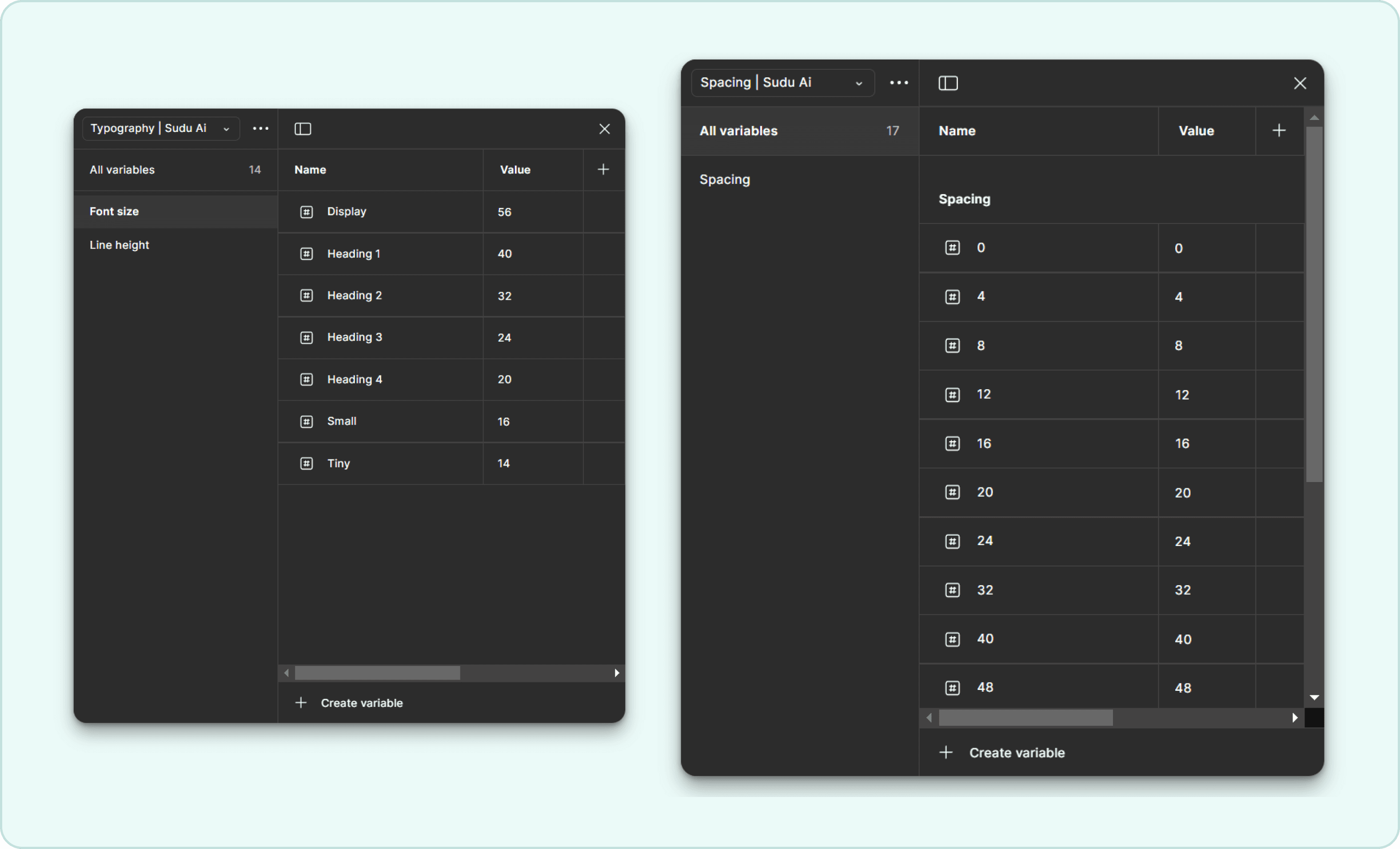
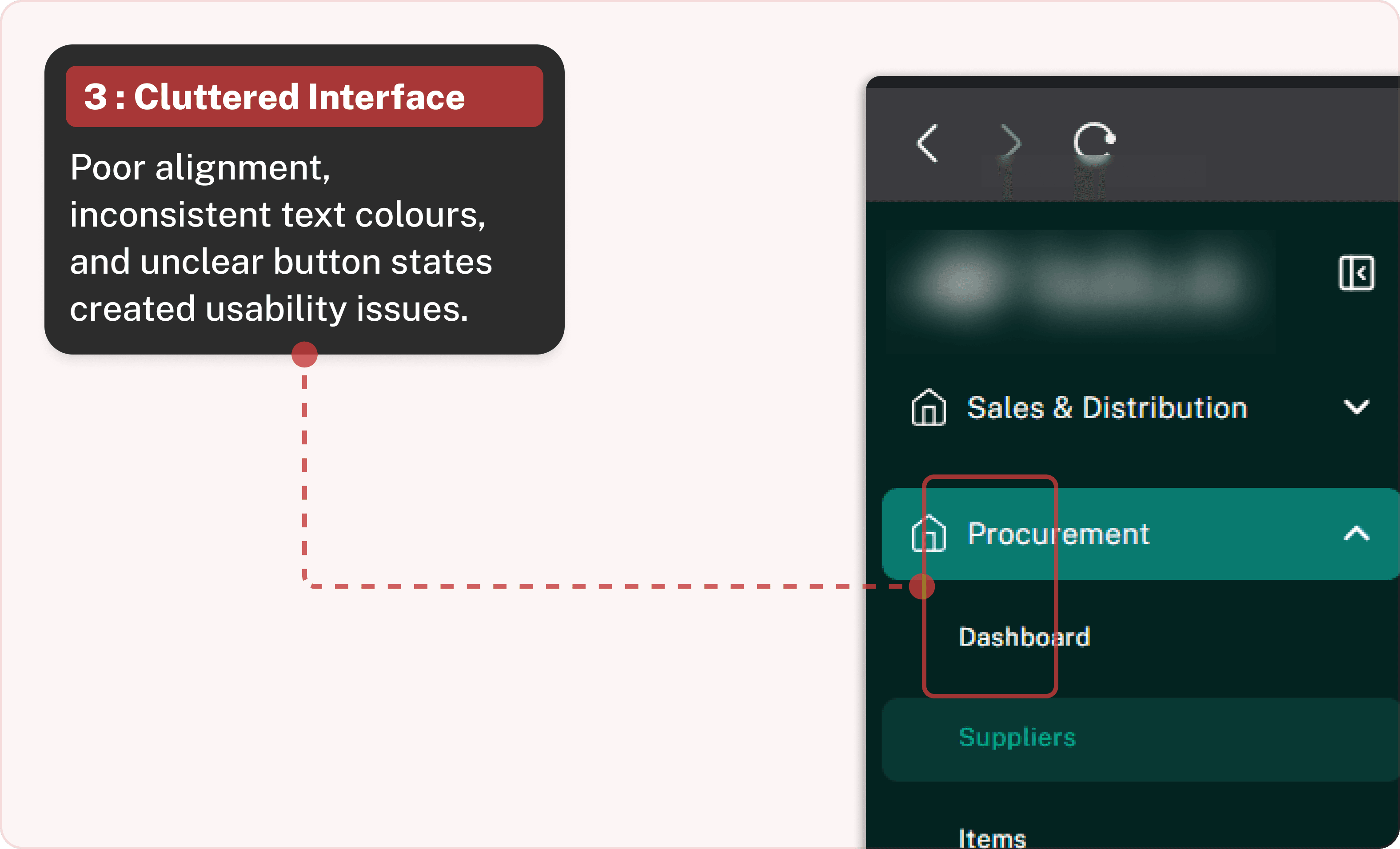
"Lack of a proper design system, misaligned components, inconsistent text colors, unclear button states, and overall usability issues that made the interface feel clunky and unreliable "


"Developed a WCAG-compliant design system, standardizing UI elements and implementing audits, feedback loops, and tests."


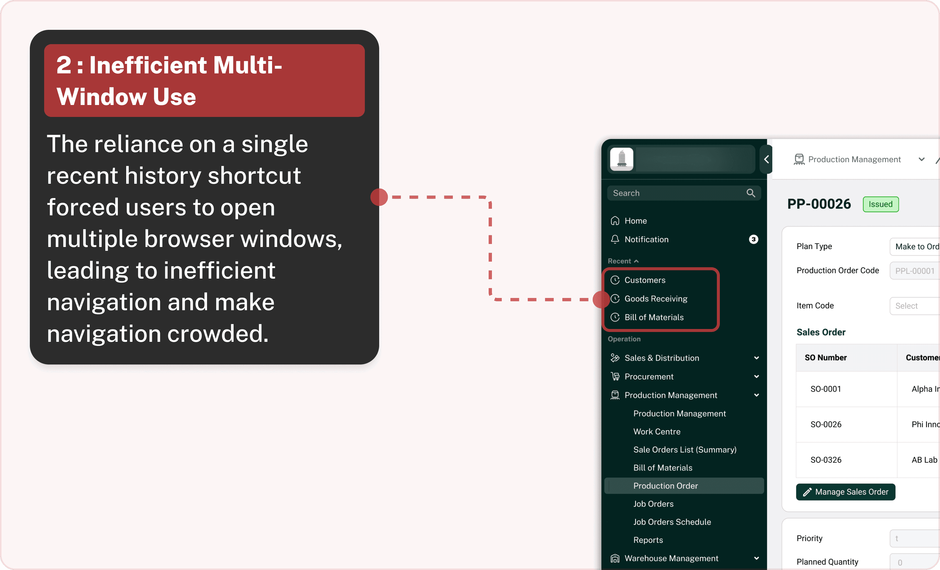
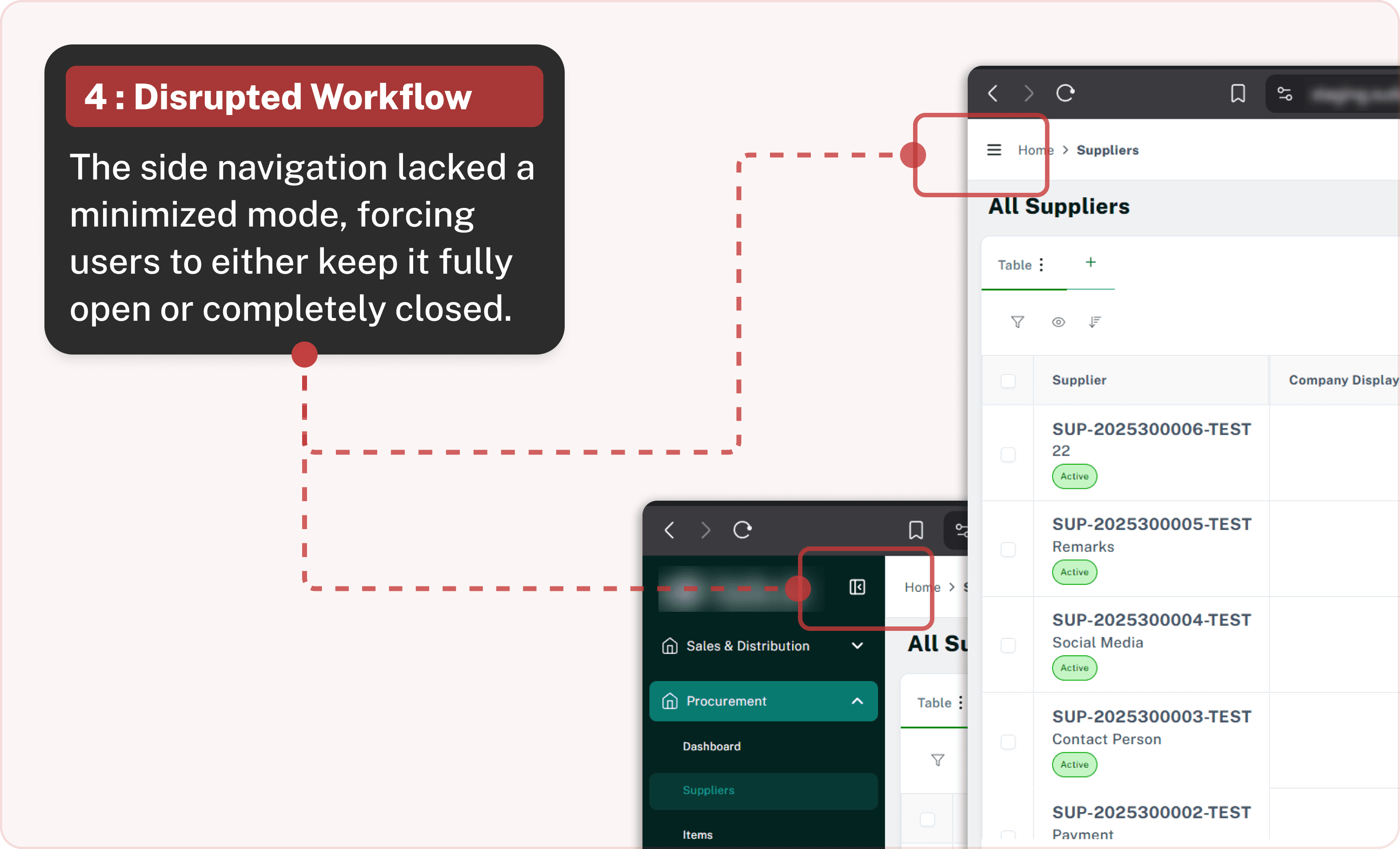
Navigating an ERP system should be effortless and intuitive, but our users found the previous design cumbersome. The dark background of the navigation panel made it visually heavy, hard to manage multitask form, and the inconsistent design elements contributed to clutter and confusion. I set out to redesign the ERP navigation to enhance usability, reduce cognitive load, and improve efficiency.
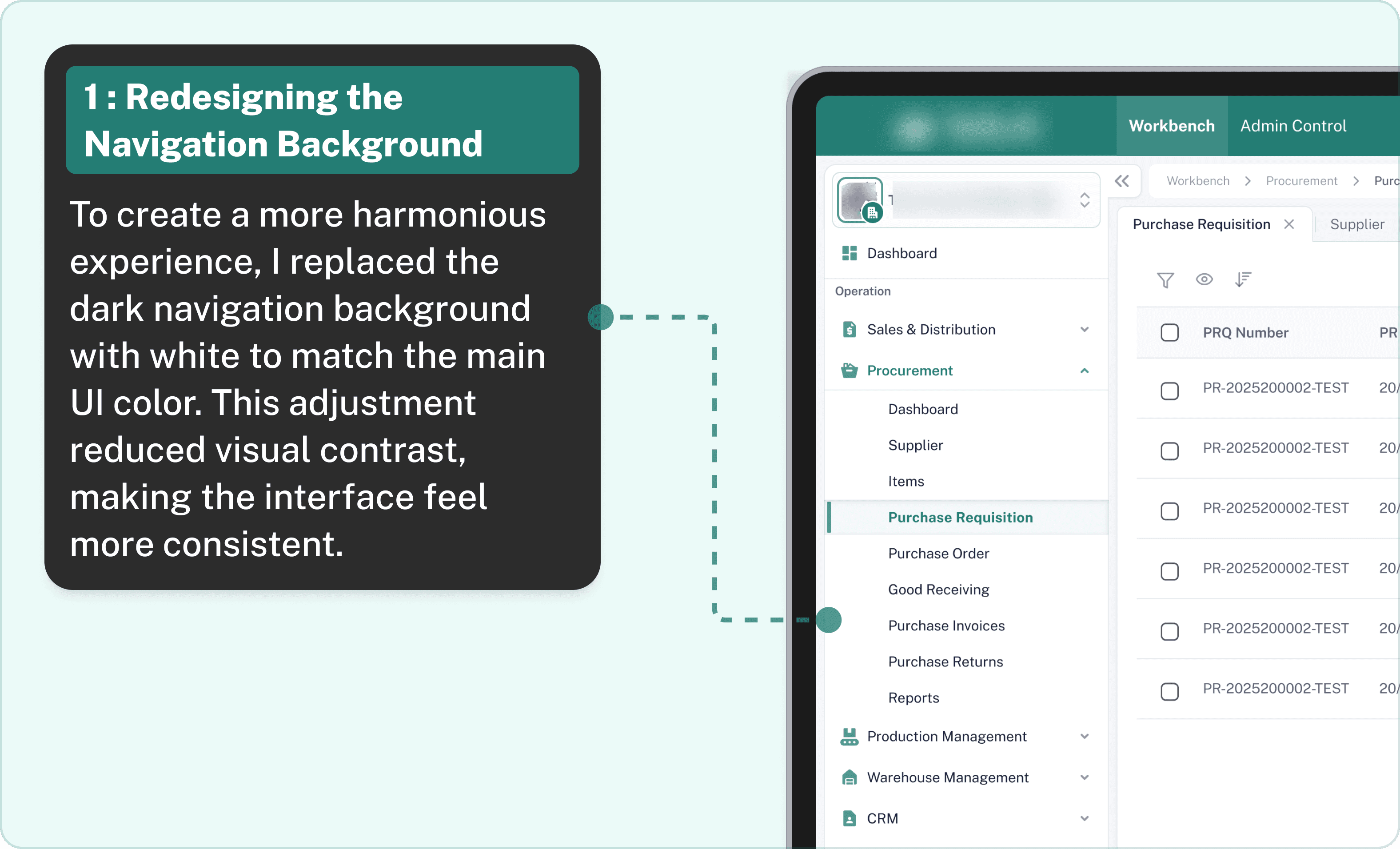

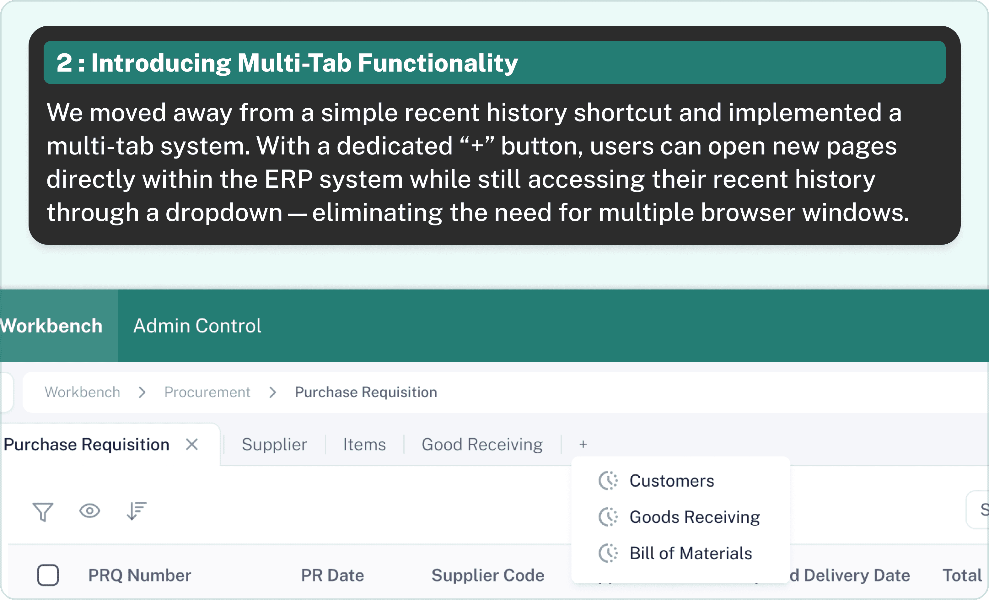

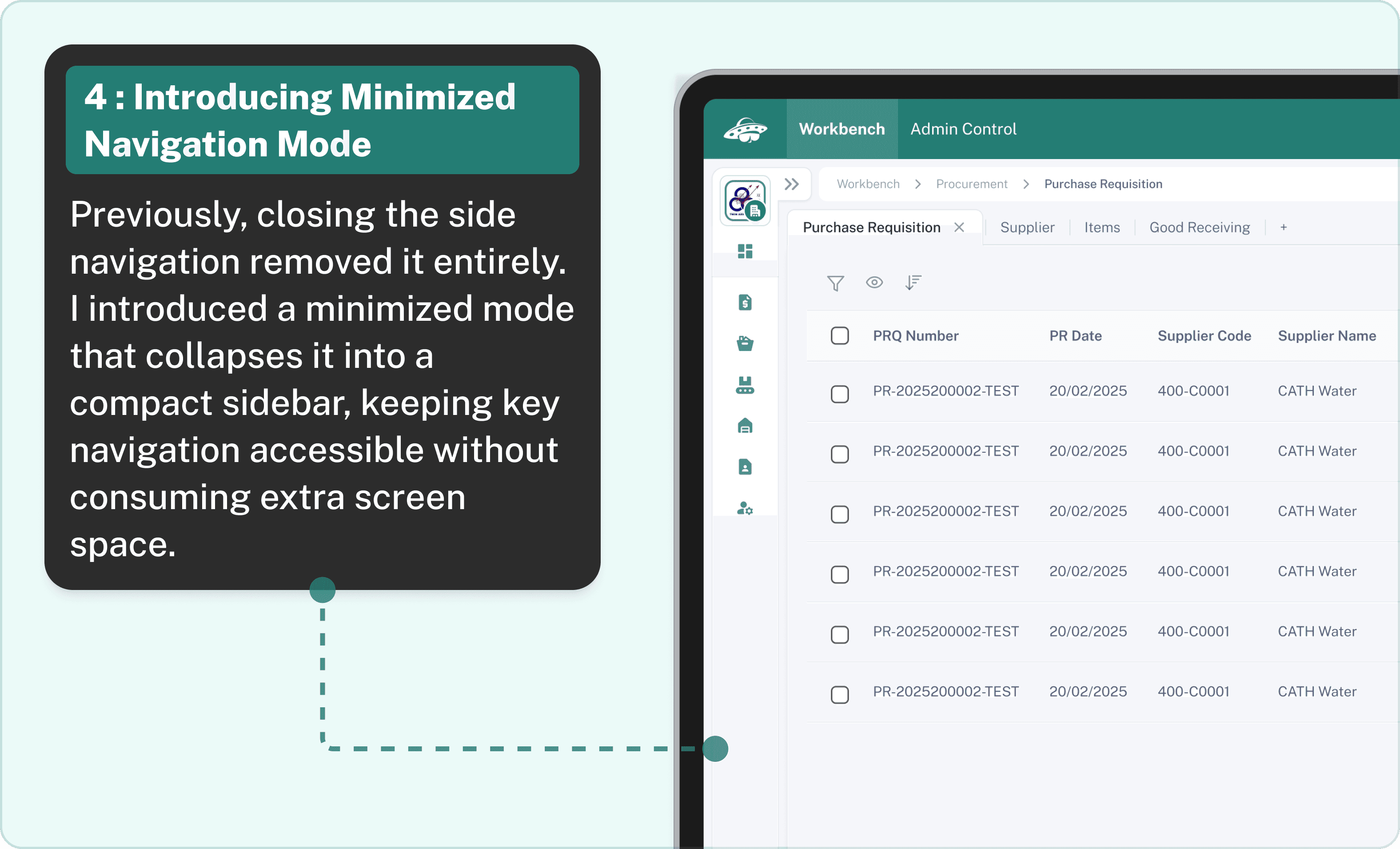
Switching to a clean white backdrop, adding multi-tab functionality, and offering a flexible minimized mode have turned our ERP navigation into a more intuitive, less distracting experience.
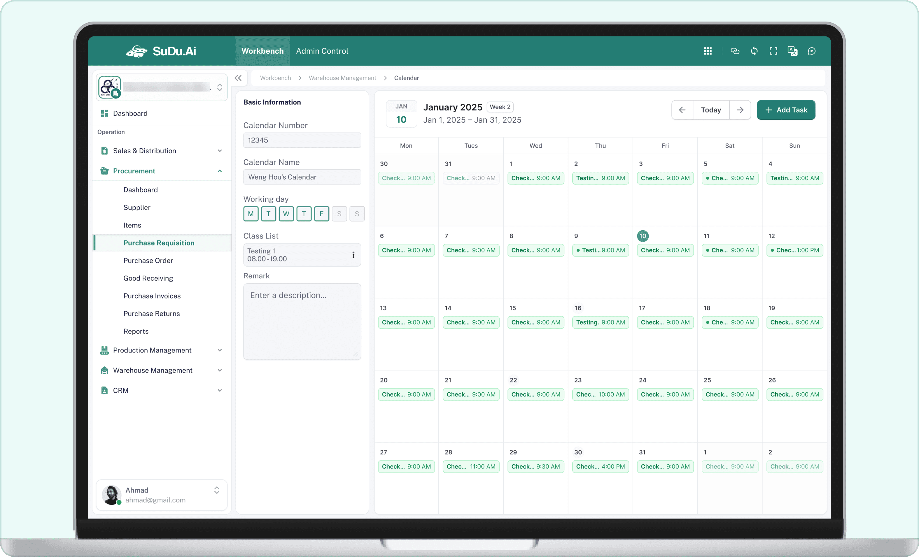
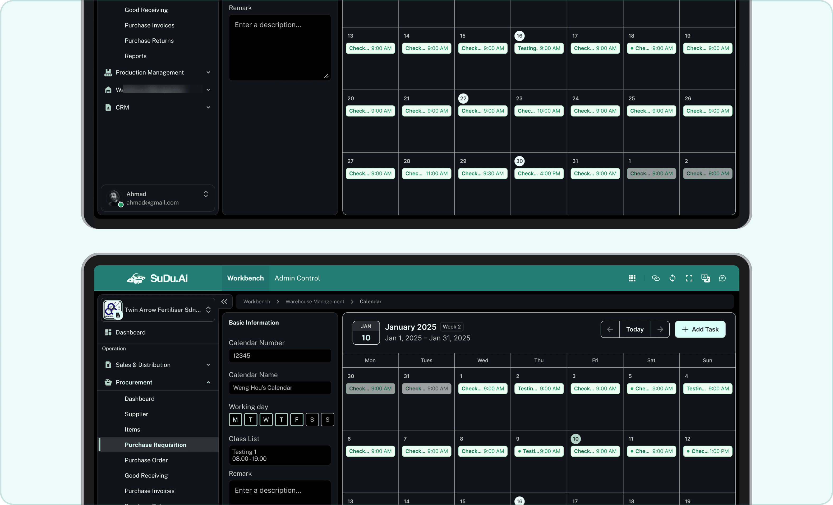
Our ERP system did not have a calendar. This lack meant users struggled to manage tasks and deadlines across different modules. There was no centralized tool for scheduling or setting reminders, which made coordination and planning inefficient and confusing.


For sudu.Ai ERP, I designed a new dashboard that serves as the command center for users, providing a clear and engaging view of key metrics and insights. The goal was to create an interface that is visually appealing and intuitive, enabling users to quickly grasp essential information and navigate the system with ease.
The previous dashboard was cluttered and overwhelming, making it difficult for users to locate critical information. With a mix of excessive data and confusing navigation, users were often left feeling lost. The challenge was to distill complex data into a clean, easy-to-read layout without sacrificing functionality.
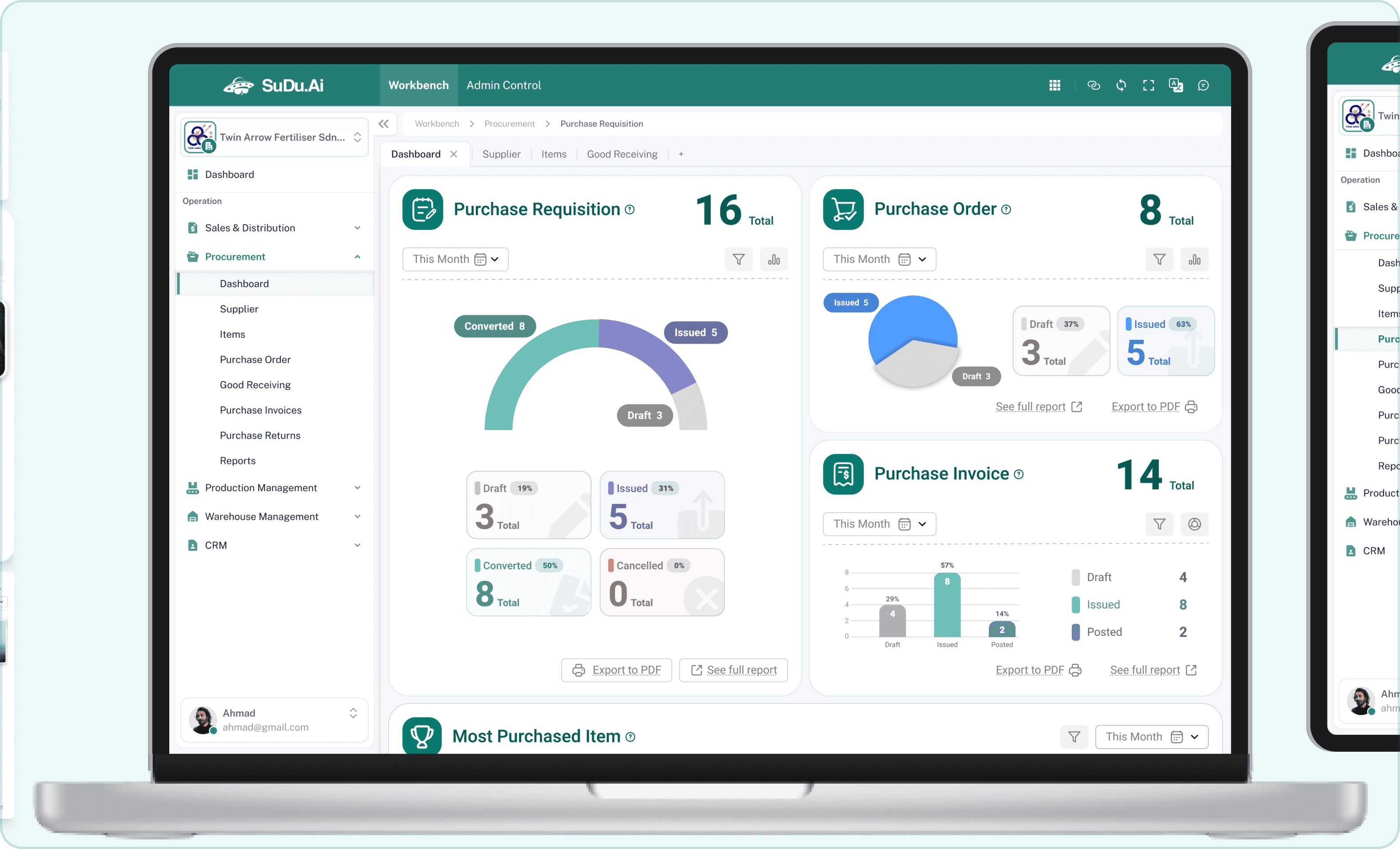
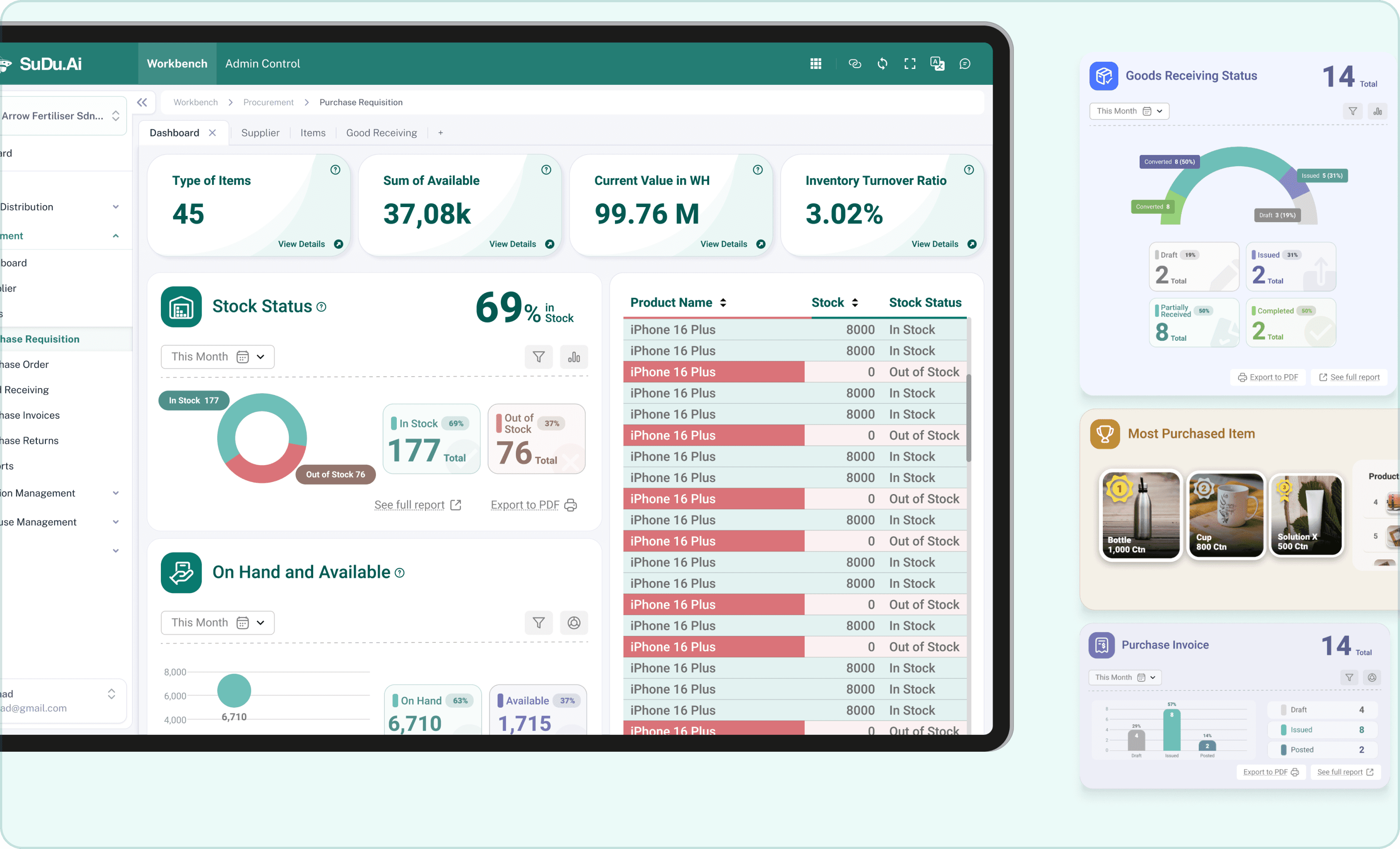

I began by researching industry-leading ERP dashboards and identifying the most important elements for effective data display. I then created several sketches and wireframes, experimenting with different layouts until I found one that prioritized key metrics and minimized clutter.
Due to tight deadlines, I conducted quick feedback sessions with company staff instead of formal user testing. This internal review helped me fine-tune the design based on immediate, practical insights. I also created a video guideline demonstrating how to navigate and interpret the dashboard, ensuring that everyone on the team understood the new design's benefits.
The original settings page was cluttered and confusing. Each module was displayed as a card, and with so many modules, the layout became overwhelming. Users found it hard to locate the settings they needed, which slowed down their work and increased frustration.


I rethought the entire structure of the settings page. Instead of a crowded card layout, I organized the settings into clear, separate sections for each module. I added distinctive icons for every sub-setting to make it easier for users to quickly identify and navigate to the desired option. This new design focused on simplicity and clarity, ensuring that each element had its proper place.


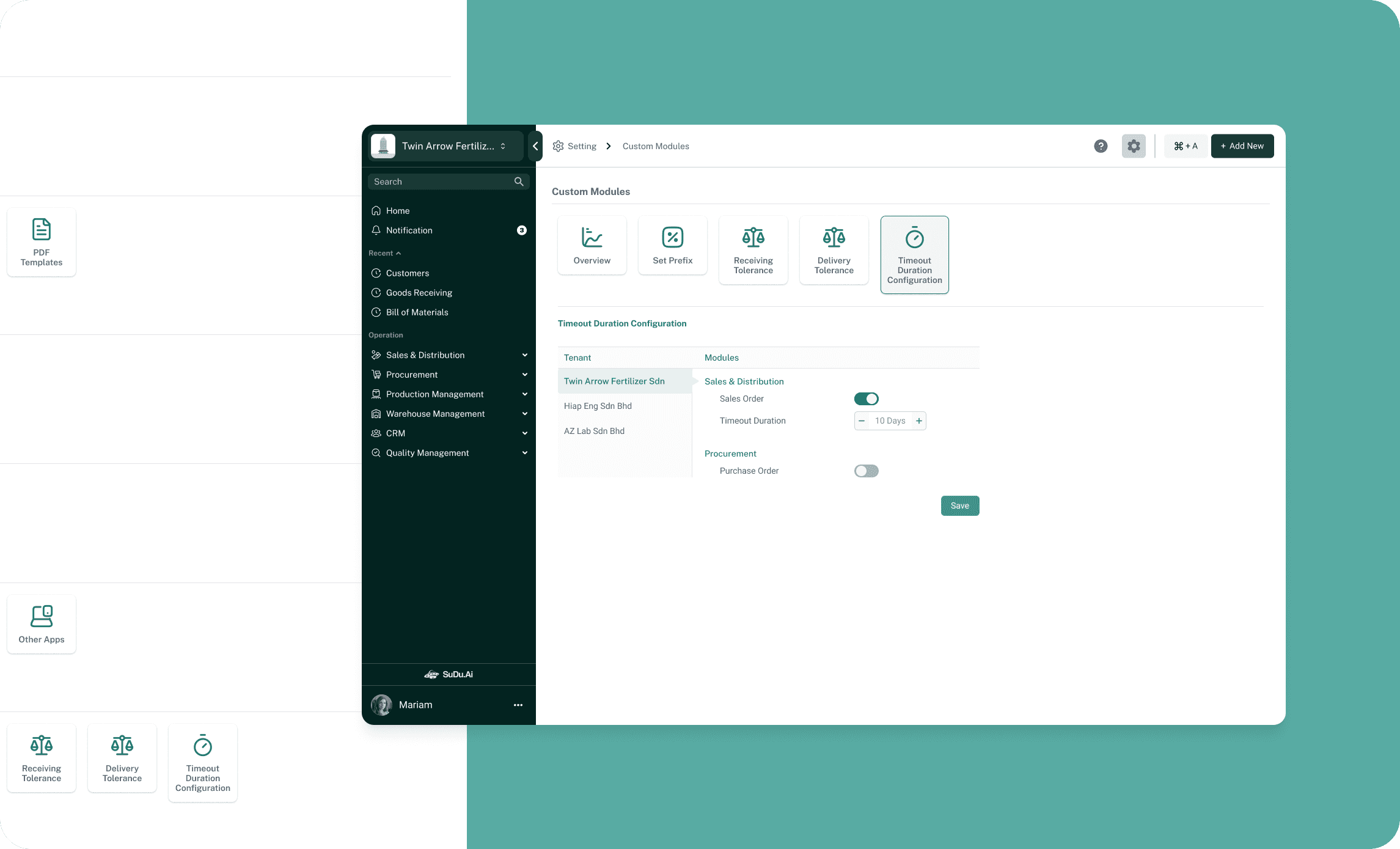
The original settings page was cluttered and confusing. Each module was displayed as a card, and with so many modules, the layout became overwhelming. Users found it hard to locate the settings they needed, which slowed down their work and increased frustration.
I rethought the entire structure of the settings page. Instead of a crowded card layout, I organized the settings into clear, separate sections for each module. I added distinctive icons for every sub-setting to make it easier for users to quickly identify and navigate to the desired option. This new design focused on simplicity and clarity, ensuring that each element had its proper place.
Dev Handoff, Documentation & Testing
Our redesigned UI did not always match the design vision. Some elements like colors, fonts, button styles, and layout details were inconsistent with our original design. This created confusion and extra work for both designers and developers. This is because lack of proper UI design guideline.
I took a hands-on role to fix these issues. First, I reviewed the entire UI to spot any mismatches between the design guide and the live product. I also checked the developers' code styling during testing to ensure consistency and quality. Then, I created a detailed, easy-to-follow guide for the developers, explaining our style rules with clear instructions and visual examples.
For every new design update, I also produced a detailed development UI guideline. This document includes visual examples, step-by-step instructions and wireframe, and best practices to maintain our design vision. These clear, actionable guidelines empower the development team.