

When I joined SuDu AI ASC, one of the biggest challenges was the lack of a proper design system. Without clear guidelines, the ERP system's UI was inconsistent. Colors varied across screens, spacing was uneven, and typography lacked structure. This not only affected the visual appeal but also made the user experience confusing and inefficient.
"Lack of a proper design system … System's UI was inconsistent, colors varied across screens, spacing was uneven, and typography lacked structure."
Before

I proposed a new design system and took the lead in building it from scratch—standardizing colors, typography, spacing, and components. This ensured a cohesive and scalable framework, improving UI consistency and streamlining collaboration.
"Good design is not just about aesthetics, it’s about creating a system that allows for consistency, efficiency, and growth."
Good design isn’t just about aesthetics, it’s about creating a system that enables consistency, efficiency, and growth. By establishing this structured system, I transformed the ERP’s interface into a polished, user-friendly experience, ensuring long-term scalability.
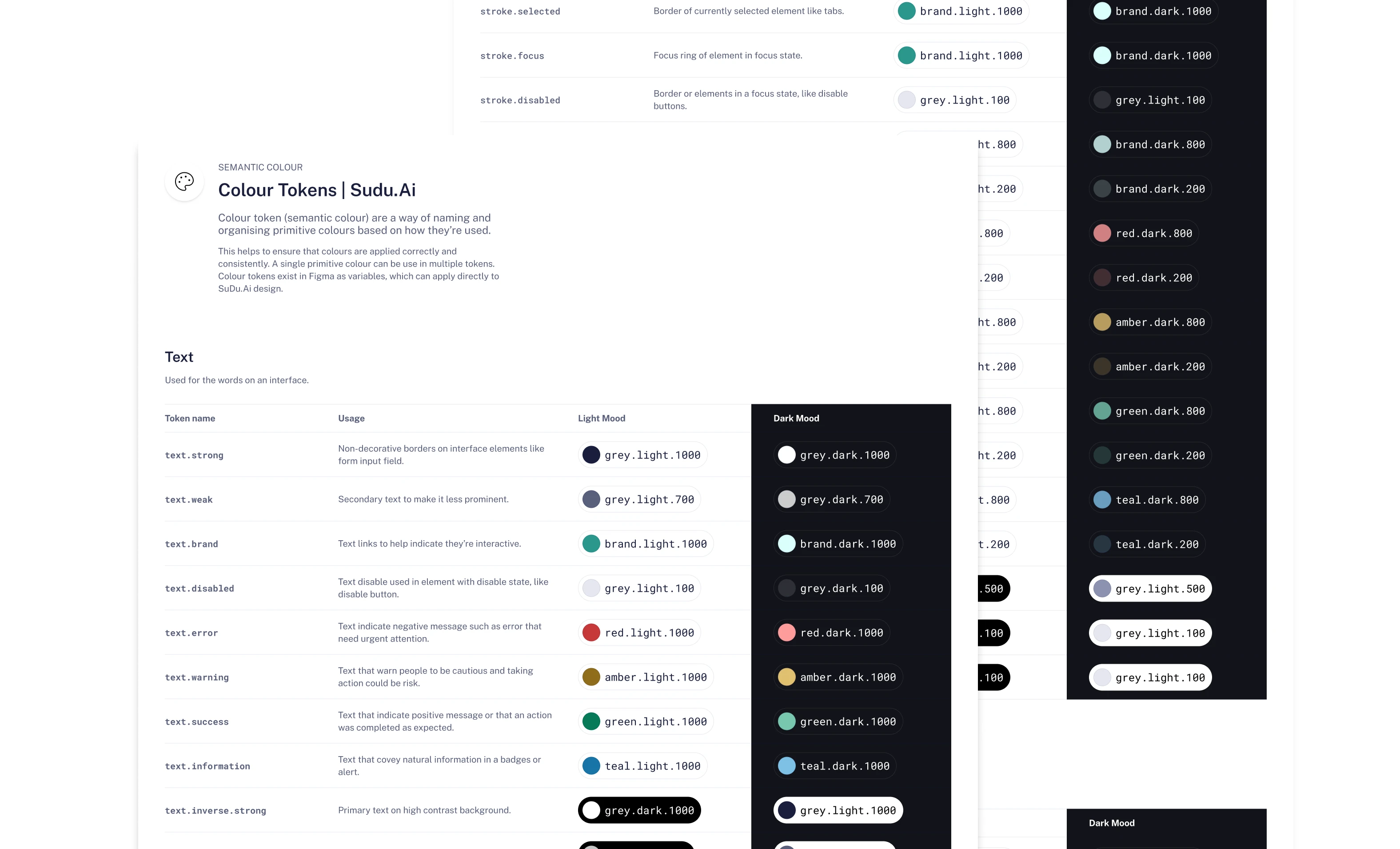
First I developed a color system with structured token naming, ensuring consistency across actions, alerts, and states. With clear guidelines for the team and WCAG-compliant contrast, this system enhanced accessibility, streamlined development, and made dark mode implementation seamless—creating a scalable and user-friendly experience.
A well-documented dual-color variable system ensures seamless light and dark mode support, maintaining consistency, scalability, and easy management.
I also developed a structured spacing, elevation, and typography system to ensure consistency and scalability.
"Good design is invisible, but we experience it through smooth navigation and effortless usability."
From my experience , I understand that somehow good design is invisible, but we can experience it through smooth navigation and effortless usability. One of other reason to have good design foundation is it creates a cohesive and accessible experience while making development smoother.
When I joined ASC Sdn Bhd, I quickly noticed the design process was disorganized and inefficient. Everything was built in Adobe XD, making collaboration difficult. I proposed migrating to Figma for better teamwork and pushed for a proper design system to replace the incomplete, unreliable one.
Without structure, designers kept reinventing colors and formats, leading to inconsistency and wasted time. The real challenge is to convincing the CEO and product manager to invest in this change—especially with tight deadlines.
"Best way to persuade people is with facts, not arguments."
Instead of just arguing my case, i directly demonstrating them example how a structured system would boost efficiency, maintain consistency, and speed up iterations and why it important, because the best way to persuade people is with facts, not arguments.
I strongly believe foundation today will saves countless hours tomorrow.